The User Interface
Usability is Where Software Succeeds or Fails
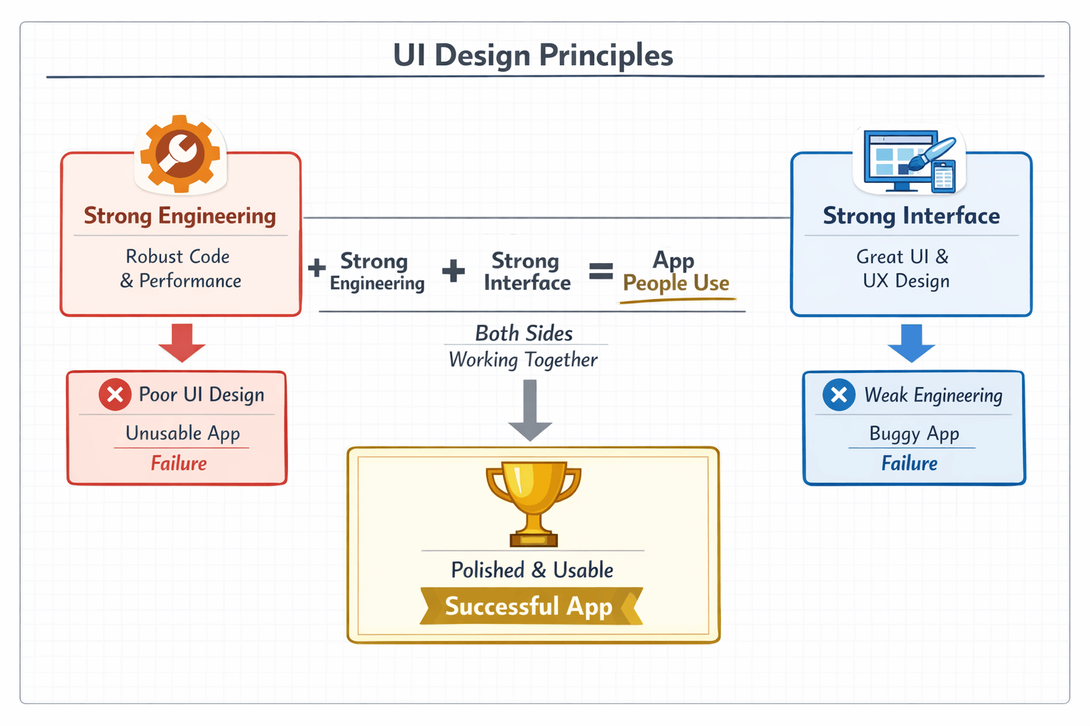
You built the engine. Now build the car people actually want to drive.
You Built the Engine. Now What?
Imagine you just built the world's best engine. It's powerful. It's efficient. Every part is in the right place. It runs perfectly on a test stand.
Now put it in a car with no steering wheel. No dashboard. No gas pedal. The doors don't open from the outside. The windshield is painted black.
How many people are going to drive that car?
Zero. It doesn't matter how good the engine is. If people can't use it, it doesn't exist.
That's where most vibe coders are right now. Part 1 of this book taught you how to build a solid engine. Architecture. State management. APIs. Databases. Security. Testing. You now understand what's happening under the hood better than 90% of people building with AI tools.
But here's the uncomfortable truth: your users will never see any of that.
They won't see your clean architecture. They won't appreciate your well-structured database. They won't know you thought about security. All they'll see is what's on the screen. The buttons. The layout. The way the app responds when they tap something. The way it feels.
That's the interface. And it's where software succeeds or fails.
First Principles Thinking for UI/UX
In Part 1, you learned to think like an engineer. Part 2 teaches you to think like a user. But how do you actually do that? How do you make good interface decisions when you don't have a design background?
The answer is the same approach that drives good engineering: first principles thinking.
First principles thinking means ignoring what other apps do and starting from the fundamentals: what does the user need, and what are the real constraints? Instead of copying patterns because they're popular, you build up from the basics. Instead of adding features because competitors have them, you ask whether your user actually needs them.
This is the foundation that all six chapters in Part 2 are built on. Every principle we'll teach you (clarity, consistency, hierarchy, feedback, accessibility, empathy) comes back to first principles. Learn this framework and you'll have a way to evaluate any interface decision, even ones we don't cover in this book.
Start With the Core User Goal
Before you design anything, ask: what is the user actually trying to do? Not what features should the screen have. Not what would look cool. What is the user's goal?
This sounds simple. It's not. Most builders think in features: "We need a dashboard." A first principles thinker asks: "Why does the user open this screen?" If the answer is "to check their account balance quickly," then the design is obvious. A big number. No clutter. Fast load. You don't need a fancy dashboard. You need a clear answer to the user's question.
Every screen in your app exists to help a user accomplish something. If you can't state that purpose in one sentence, the screen is trying to do too much.
Reduce to Essential Actions
Once you know the user's goal, ask: what is the minimum path to get them there? What steps are absolutely required? What can be removed?
Think about a checkout flow. The conventional approach has six steps: cart, review, address, shipping method, payment, confirmation. But what's actually required? The user needs to identify themselves, pay, and confirm. That's it. With autofill and Apple Pay, that can be one or two taps instead of six screens.
Every step you remove is friction you eliminate. Every screen you cut is a place where users can't drop off. First principles thinking pushes you to find the shortest possible path from "user wants something" to "user got it."
Design for Human Constraints
Your users are human. That means they have real limitations that should drive your design decisions:
Attention span. Users glance at screens for seconds, not minutes. The most important information needs to be visible immediately.
Memory. Users can hold about four things in working memory at once. If your screen requires remembering more than that, something needs to change.
Motor control. On mobile, users navigate with their thumbs. Buttons need to be big enough to tap accurately (at least 44x44 pixels) and placed where a thumb can reach.
Cognitive load. Every choice, label, and piece of information adds mental effort. The more you add, the harder your app is to use.
These aren't opinions. They're facts about how humans work. When you design around these constraints instead of ignoring them, your interface gets easier to use automatically.
Question Every UI Element
For every element on every screen, ask one question: why does this exist?
If the answer is "because other apps have it," that's not good enough. If the answer is "because the user needs it to complete their task," it stays. If you can't give a clear answer, remove it.
This is how you keep screens clean and focused. Not by following minimalist design trends. By ruthlessly questioning whether each element serves the user's goal. A screen with ten elements where every one earns its place is clearer than a screen with five elements where two are unnecessary.
Optimize for Feedback and Clarity
Here's a fundamental truth about interfaces: users need to know what's happening at all times. When they tap something, did it work? When something is loading, how long will it take? When something goes wrong, what happened and how do they fix it?
First principles say: every action needs an immediate response. Every wait needs a visual indicator. Every error needs a clear explanation. Better yet, does the user need to know about this error? What is the user expected to do about it, if anything? What options are available for correcting this error, etc...? These aren't design flourishes. They're basic requirements for an interface that humans can use with confidence.
Build From System Constraints
First principles isn't only about users. It's also about the reality of the systems your app runs on:
Network speed. What if the connection is slow? Design for skeleton loading and offline-first patterns instead of assuming fast Wi-Fi.
Device performance. Not everyone has the latest phone. Heavy animations and complex layouts can make your app feel sluggish on older devices.
Platform rules. iOS and Android have different conventions for navigation, gestures, and layout. Ignoring them creates friction for users who expect their phone to work a certain way.
When you combine user needs with system constraints, you make decisions that work in the real world, not just on your development machine with perfect Wi-Fi and the latest hardware.
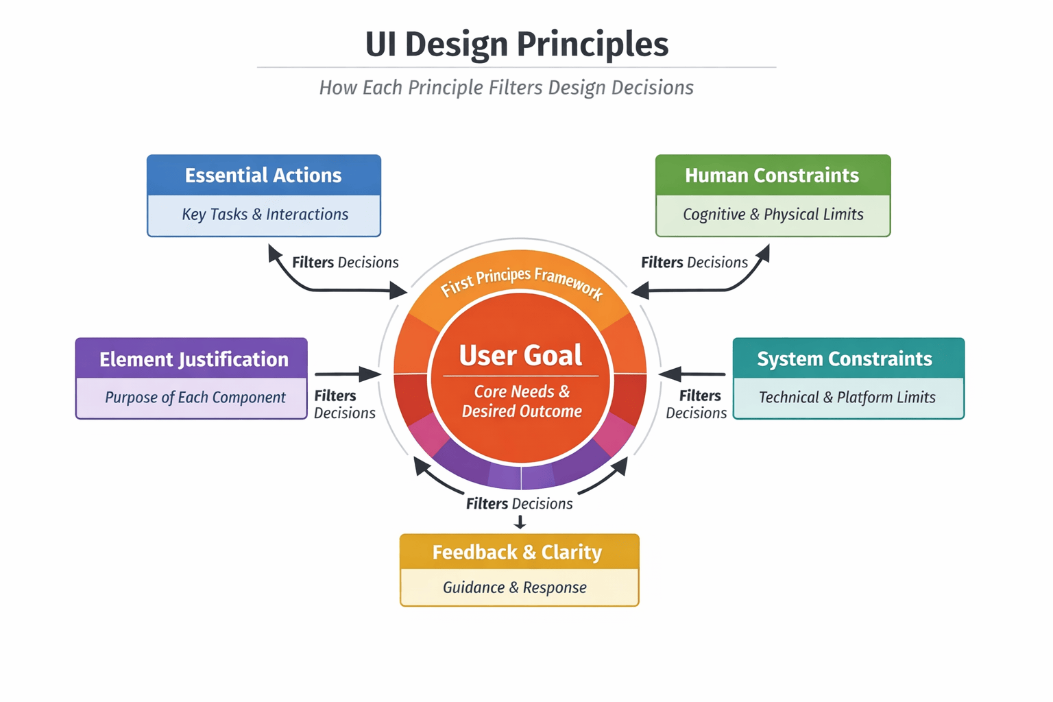
Figure 16: UI Design with First Principles Framework. User Goal is the central focus.
Elements that filter design decisions: Essential Actions, Human Constraints, Element Justification, Feedback & Clarity, System Constraints.
Ask AI
"I'm building a [describe your app]. Apply first principles thinking to the [screen name]. Start with: what is the user's core goal on this screen? Then: what is the minimum path to achieve it? What elements are essential and what can be removed? What human constraints (attention, memory, motor control, cognitive load) should drive the layout? What system constraints (network speed, device performance) should I design for?"
What Part 2 Covers
Part 1 was about the engine. Part 2 is about the experience.
Over the next six chapters, you'll learn the principles that separate apps people love from apps people delete. These aren't design trends or visual tricks. They're timeless principles that have driven great software for decades. And each one is grounded in the first principles framework you just learned.
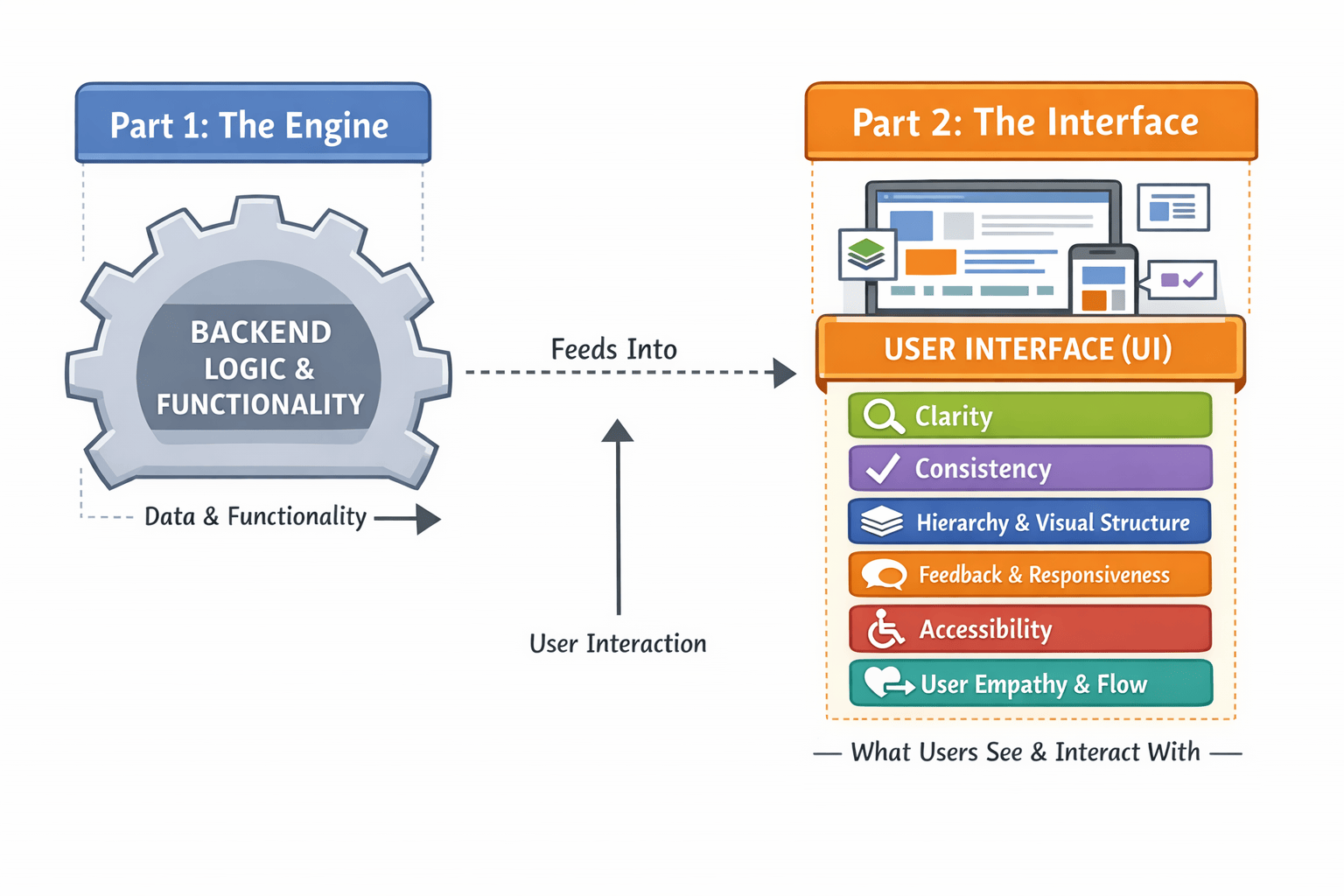
Figure 15: Part 1 (The Engine) vs. Part 2 (The Interface): how they connect. Engine feeds the interface. Interface is what users explicitly interact with.
Here's what we'll cover:
Clarity—Every screen communicates one primary idea. You'll learn how to reduce cognitive load and eliminate confusion. First principles question: what is the one thing this screen needs to say?
Consistency—Reusable patterns that make your app predictable. When users learn one part, they already know how the rest works. First principles question: can I reuse a pattern the user already learned?
Hierarchy & Visual Structure—How to use typography, spacing, and contrast to guide people's eyes to what matters most. First principles question: what should the user see first, second, and third?
Feedback & Responsiveness—What happens when a user taps a button? Good apps answer immediately. Bad apps leave people guessing. First principles question: does the user know what just happened?
Accessibility—Building for everyone, not just people who use your app the way you do. Color contrast. Keyboard navigation. Screen readers. First principles question: can every user complete this task?
User Empathy & Flow—Understanding what your users actually want and removing every obstacle between them and their goal. First principles question: what is the shortest path from goal to done?
Each of these principles builds on the others. Clarity without hierarchy is hard to scan. Hierarchy without consistency confuses people. Consistency without feedback feels dead. They work as a system. And first principles thinking ties them all together.
Keep reading.
The next six chapters turn these principles into the screens your users actually see.
Get the book →